GPSG Website Redesign

Web Design-WordPress, CSS
Project Overview
I was in charge of revamping the website. After conducting light user testing sessions and discussions with coworkers and website users, as well as personal browsing and taking notes, I came to a conclusion that the website had all the necessary content and information, but was lacking proper polish and organization.
My Contributions
I revamped the Home Page to give us a "clean slate" look, revised the Executive Board Page so our board members were represented in a more professional light, and fixed the Travel Awards fundings page. I revamped the aesthetics and solved issues.
Issue #1: HomePage
Flat, Complex, and Blurry
Time taken: 1 month
Here, you can see that the old Home Page had multitude of issues from both UX and design standpoint. First, the images used were very blurry. The banner was plain white(presumably to not make the page look flat), but the issue persisted in other pages where there were no background images to counteract that. The use of image cutting in is a nice tool but looked more cluttered and disturbing. Fionally, the buttons are flat and does not pop out. These should be the most clicked buttons therefore most easily findable and aesthetically pleasing.

I updated the banner to accommodate all other pages, while simultaneously fixing the banner problem of making all the other pages look flat. I also replaced the background image and the banner image both with free HD photos of UNC campus.

I used a much simpler layout and only used the cutting image feature at the top, while dividing the rest of the page with a simple grey/white outline. I put the most frequented buttons at top, and made the buttons boxier and bigger while also using UNC-colored icons to visually communicate to the users what its function is for.
Issue #2: Executive Board Page
Repetitive, Excess scrolling
Time taken: 2 weeks
There was common theme from feedback that the Executive Board Page, which is supposed to represent the Board members who run the Student Government, have a rather long introduction that requires excessive scrolling to view everyone at hand. They also had repetitive introduction paragraphs.

To counteract this, I made a list of card profiles that jumps to each respective member. I also separated each member's introduction clearly through boxing them in, giving each member a well earned spot in the page. I also utilized the drop down function to hide the general duty of their roles. I also added UNC's mascot Ramses to the side menu which just adds a little bit of flaire.


Issue 3: Travel Awards page
Confusing, Outdated
Time Taken: 2 weeks
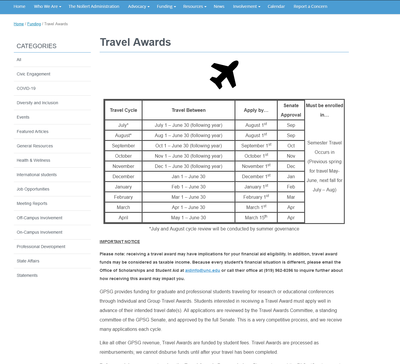
The Travel Awards page crew came to me and asked to revamp the table entirely. It took me awhile to understand the table itself, which is a testament to its desperate need for a change. The overall table is trying to communicate the deadline of application for travel fund awards depending on the travel date. Problem is, the table itself is very confusing. The Travel Cycle does not properly reflect the date(Travel Cycle December= Jan 1st ~ June 30th), the senate approval overlaps, and is overall just a very complex table that does not serve the users. Not only that, but the page had numerous broken links and outdated information. Can you try to tell me when you would need to apply by if you are travelling on February 1st?

1. Table
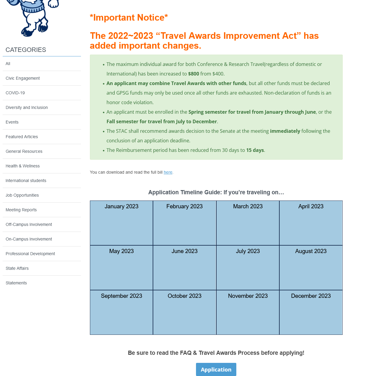
I solved this issue by making the table more intuitive. I got rid of the table entirely, because after speaking with the manager in charge of Travel funds, we came to a conclusion that the users would use this page to look for when they are travelling precisely. So I made it into a calendar system where the users would come in to the website with a travel date in mind, and then they would be able to select a hover profile that showcases exactly when they need to apply by, and when the senate approval would happen for that travel date. To answer my question from earlier, using my new calendar hover profile, I can instantly answer that travelling anytime on February would mean I have to apply by January 1st, with the senate approval happening on February itself.

2. Updates
The new bill had passed and there were important changes made to the travel funds website, crucial things such as the maximum individual awards and the fact that travel awards can now be combined with other awards. Both of these were not updated on the page, which would be misleading the users for the wrong reasons.

I could have just "snuck in" the updates from the new bill onto the lengthy paragrahpy hidden below the table and call it a day, but I understood that there still may be visitors who are not aware of the new bill that had passed. Therefore, I made a point to highlight the recent changes from the bill with usage of bigger red fonts that capture the user's attention and the green jumbotron that clearly indicates important information for newer visitors.

I believe part of Website design/UX design is to clearly understand how the users would feel about searching for their information when they visit the page, thus I believe I showcased this ability very well.